DMB VIA ALL SYSTEMS GO
Dave Matthews Band
Project
Official Website
Year
2023
Roles
Art Direction
UX Design
Web Design
AI Photography
UX Design
Web Design
AI Photography
SYNOPSIS
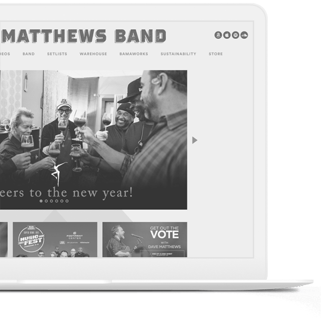
In my recent collaboration on the redesign of the Dave Matthews Band website, we aimed to create a digital space that truly reflects the band's dynamic energy and rich musical legacy. This project was a deep dive into UI/UX and visual design, with a focus on enhancing fan engagement and streamlining navigation.
PURPOSE
To transform the website into a more engaging, user-friendly, and visually appealing platform. By modernizing the design, simplifying navigation, and ensuring mobile compatibility, we aimed to provide seamless access across all devices. Integrating social media and streamlining sales processes were strategic moves to enhance community engagement and operational efficiency.
PROJECT SUMMARY
Areas of Impact
01 BRANDING
Our redesign encapsulates the band’s vibrant and heartfelt essence, fusing deep, rich hues with a modern edge. This isn’t just a website; it’s a digital embodiment of the band’s artistic evolution, crafted to captivate both long-time fans and new listeners.
02 EXPERIENCE
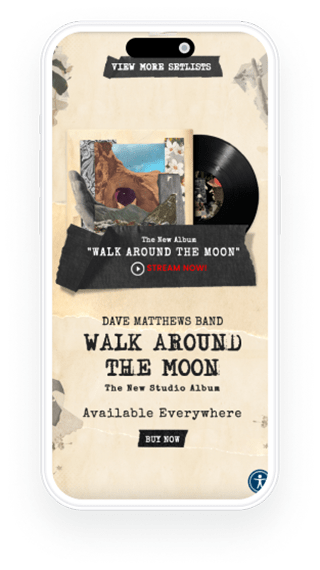
Our user-centric design approach ensures that every visit is an experience, not just a browsing session. From interactive tour maps to behind-the-scenes content, the website invites fans on a journey through the band’s storied career, with intuitive navigation and engaging layouts that bring their music to life.
03 MOBILE
Stay connected with Dave Matthews Band wherever you are. Our mobile-responsive design delivers a seamless experience on all devices, ensuring fans can access tour dates, music, and merchandise on the go.
04 OUTREACH
With strategic SEO and digital marketing, we’re extending the reach of Dave Matthews Band to music lovers everywhere. Enhanced social media integration means fans can share their experiences, while newcomers can discover the band’s rich musical legacy, creating a growing community of enthusiasts and aficionados.
05 MESSAGING
Our messaging strategy is crafted to be as clear and compelling as the band’s lyrics, conveying information with an authentic voice that speaks directly to the heart of the fans. From concert announcements to album releases, our content is designed to inform, engage, and inspire.
CONCEPT
Layout & Structure
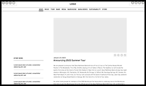
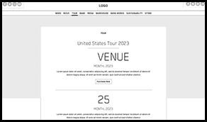
The initial wireframes were crafted to effectively showcase the marketing needs for the Dave Matthews Band’s official website, providing a clear visual representation without the immediate need for intricate, high-fidelity designs.


ARTISTIC
Collage
Crafted a unique, organic collage to be used as the background, using various forms inspired by the visual branding of the new album, seamlessly blending elements to create a cohesive and striking visual representation.

HOMEPAGE
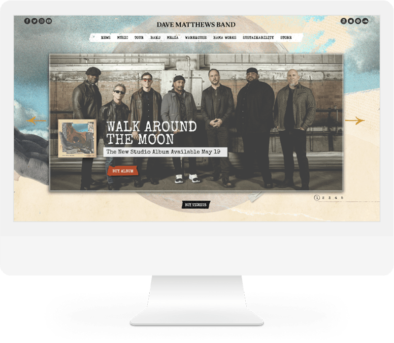
The New DMB Site
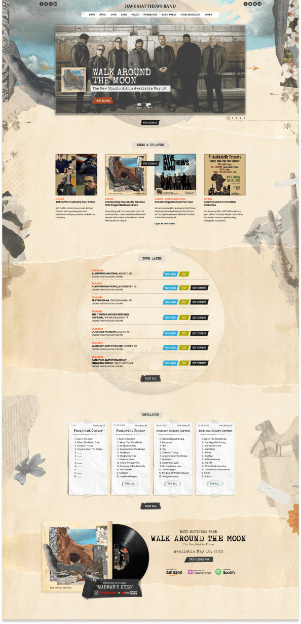
The newly redesigned DaveMatthewsBand.com is a harmonious blend of artistic flair and user-centric design. It features a visually stunning interface that reflects the band’s signature style, with rich, immersive graphics and an intuitive layout that guides fans through a seamless journey of music discovery. Enhanced for optimal performance across all devices, the website offers easy access to tour dates, album releases, and exclusive content. Engaging multimedia elements and integrated social media platforms enrich the experience, making it a dynamic hub for the vibrant Dave Matthews Band community.
WEBSITE DETAILS
Screen Designs
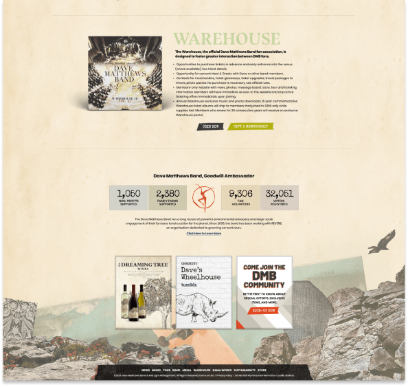
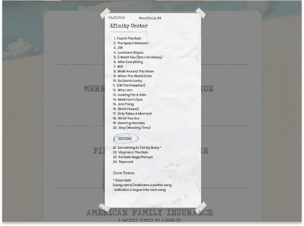
We crafted a blend of foundational templates and distinctive pages, ensuring optimal flexibility while consistently delivering innovative and engaging layouts across the website.
RESPONSIVE DESIGNS
Mobile Screens
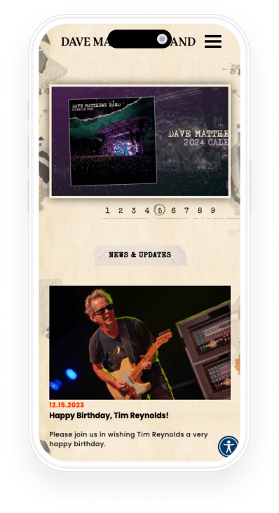
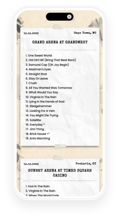
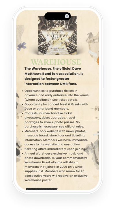
Our features were meticulously engineered to function seamlessly across a wide spectrum of screen sizes, ensuring compatibility and optimal performance from mobile and tablet devices to desktop screens.

Our designs were meticulously crafted for adaptability, ensuring a seamless and consistent user experience across all device types. This enhanced mobile responsiveness effectively created new engagement funnels, amplifying the brand’s reach and impact.
TYPE CHOICES
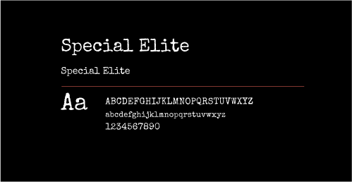
Typography
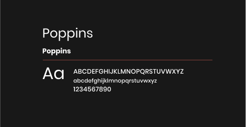
Special Elite was selected for its crisp and inviting appearance in larger displays, while Poppins was chosen as a complementary typeface due to its excellent legibility in smaller text sizes, enhancing the overall readability and user experience on the website.

TYPOGRAPHIC SCALE

Let’s talk about your next project
At We Are VK, we redefine creativity. We’re not just a creative agency; we’re your partners in innovation, design, and storytelling. From concept to execution, we bring your ideas to life with a touch of innovation, a dash of imagination, and a whole lot of passion.
© 2023 – 2024 WeAreVK, Inc. All Rights Reserved. Terms & Conditions