COMBAT WAFFLE
Ghosts of Tabor
Project
Website + Game Client
Year
2022
Roles
Art Direction
UX Design
UI Design
Web Design
Web Development
In-Game Design
UX Design
UI Design
Web Design
Web Development
In-Game Design
SYNOPSIS
When approached by the creators, my mission was to craft a website that would seamlessly introduce visitors to their virtual realm. The objective was to encapsulate the game's core essence and offer users valuable insights into its distinctive VR gameplay.
PURPOSE
The website for “Ghosts of Tabor” serves to promote the game, engage and inform players, build a community, offer support, and facilitate marketing, sales, and feedback. Its main goal is to enhance the game’s presence and success in the VR gaming industry.
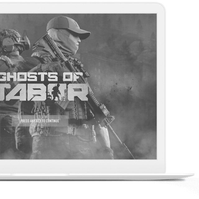
PROJECT SUMMARY
Areas of Impact
01 BRANDING
Our site design aligns with the intriguing atmosphere of “Ghost of Tabor.” Careful consideration goes into every visual element and color choice to reflect the game’s unique identity. Experience a consistent representation of the game’s brand, setting the stage for your journey into the VR world.
02 EXPERIENCE
Serves as your entry point to the immersive realm of “Ghost of Tabor.” Designed with user convenience in mind, it offers an intuitive experience. You can explore game details, delve into the storyline, and prepare for VR gameplay with ease.
03 MOBILE
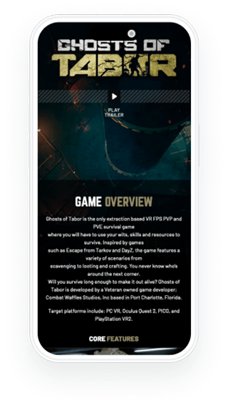
Our mobile-responsive design ensures that game information, updates, and community discussions are accessible from your smartphone or tablet.
04 OUTREACH
It facilitates outreach efforts, introduces the game’s story to new players, and helps grow the community. Explore ongoing outreach initiatives and connect with like-minded enthusiasts to be part of the evolving Tabor experience.
05 MESSAGING
The website acts as a community hub. Engage in discussions, share insights, and connect with fellow players. Stay informed about game developments and receive messages from the creators to stay in touch with the community.
HOMEPAGE
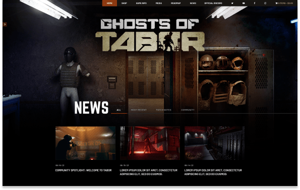
The Official, Website for Ghost of Tabor
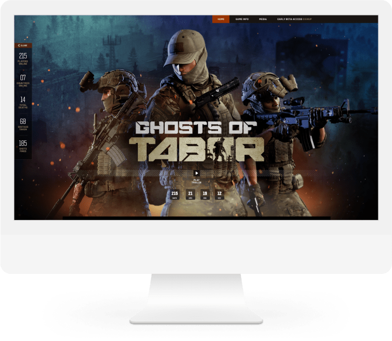
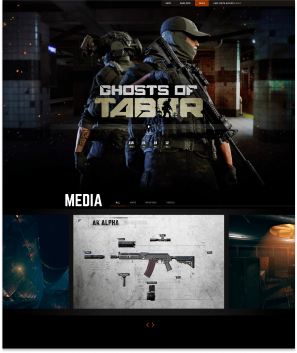
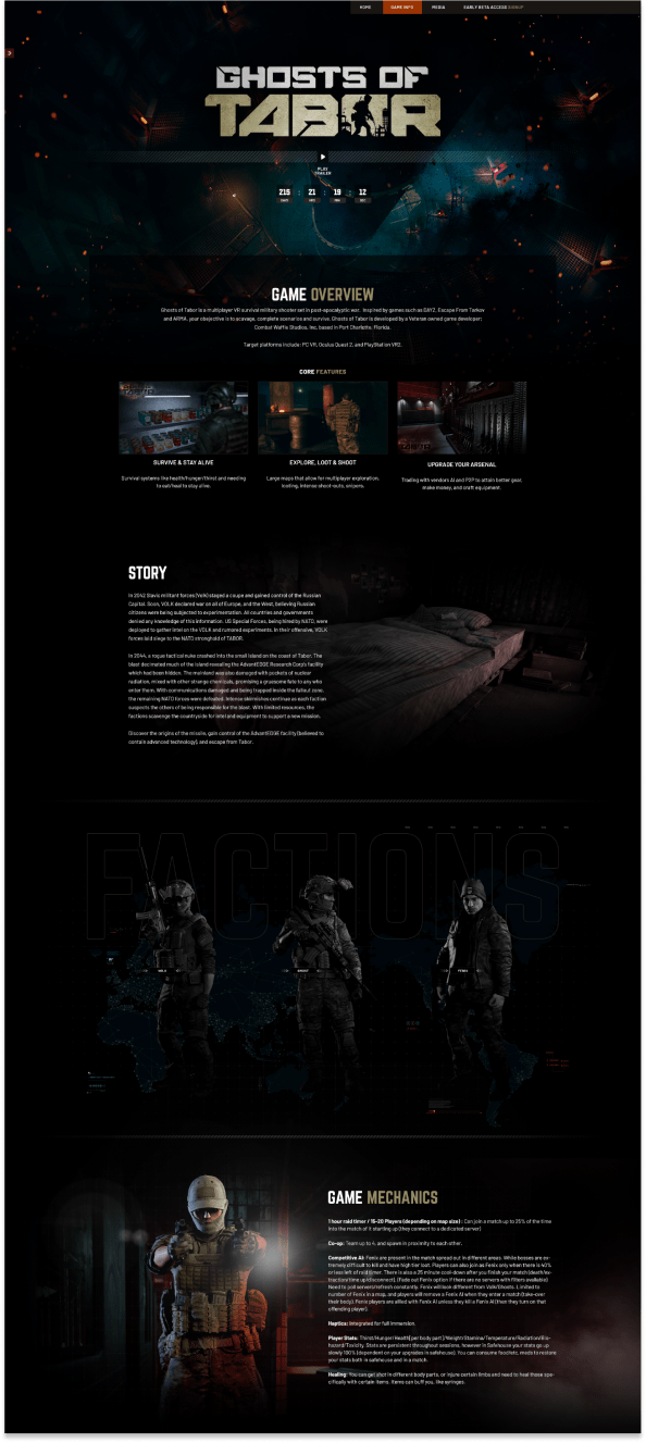
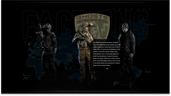
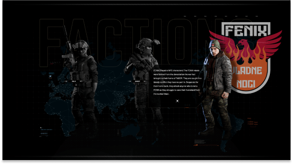
Our website design is inspired by the game’s atmosphere, with a focus on providing easy navigation through the game’s details. The layout is mobile-responsive, ensuring accessibility across devices. You can explore the game’s backstory, characters, and gameplay mechanics.
WEBSITE DETAILS
Screen Designs
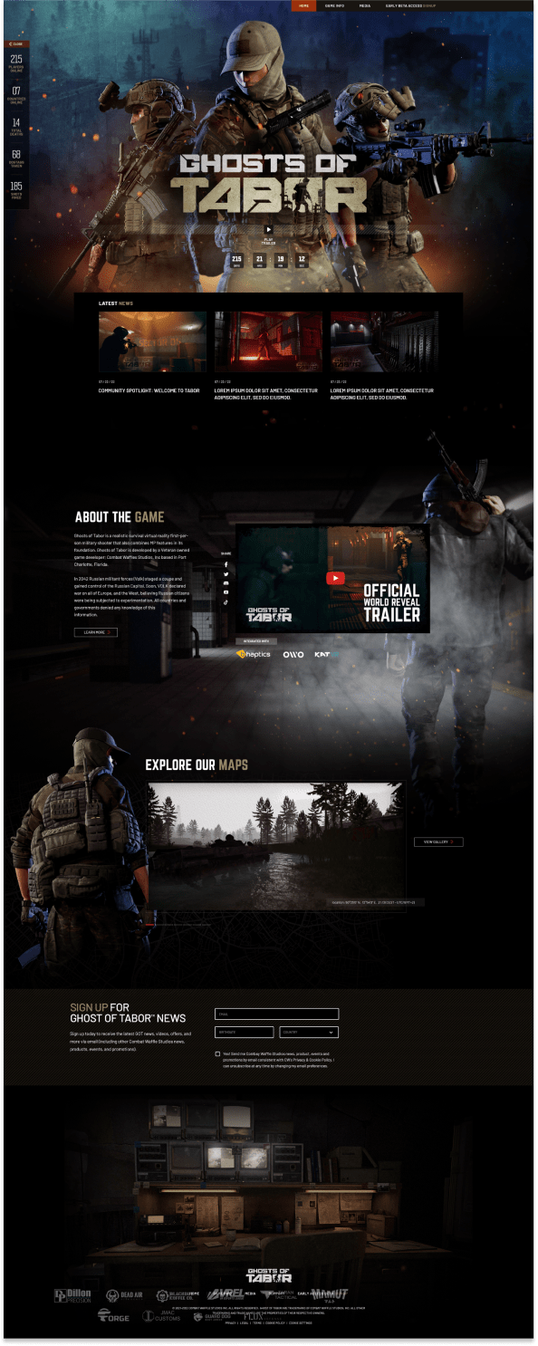
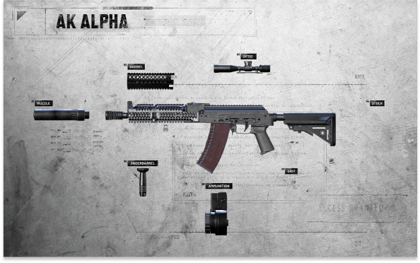
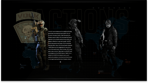
We crafted a blend of foundational templates and distinctive pages, ensuring optimal flexibility while consistently delivering innovative and engaging layouts across the website.
UI DESIGN
In-Game Screens
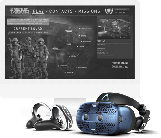
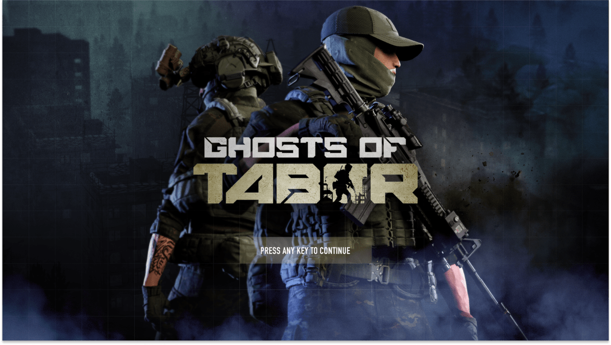
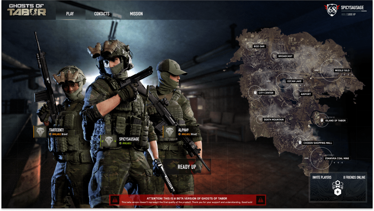
The initial UI design by the first developers left the game feeling cluttered, dated and lacking visual design. Our challenge was to reimagine the UI, focusing on achieving a clean and user-friendly interface that enhances the player’s experience. This involved creating new UI elements tailored to the theme and atmosphere of the ‘Ghost of Tabor’ game, ensuring that every element not only looked appealing but also contributed to an intuitive and immersive gameplay environment.

TYPE CHOICES
Typography
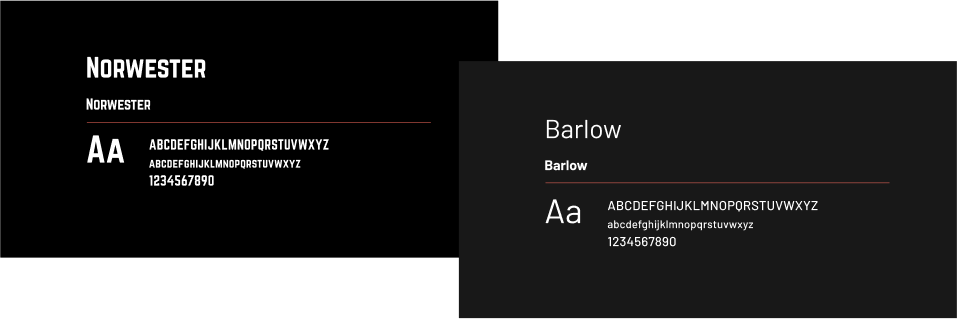
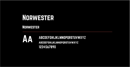
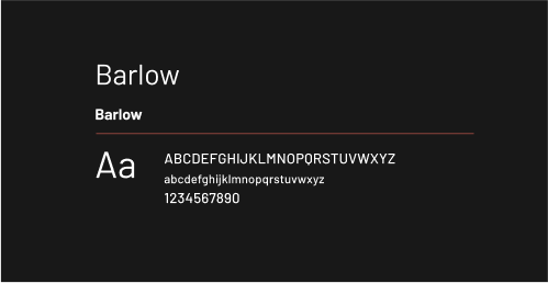
Norwester was selected for its crisp and inviting appearance in larger displays, while Barlow was chosen as a complementary typeface due to its excellent legibility in smaller text sizes, enhancing the overall readability and user experience on the website.
TYPOGRAPHIC SCALE

Let’s talk about your next project
At We Are VK, we redefine creativity. We’re not just a creative agency; we’re your partners in innovation, design, and storytelling. From concept to execution, we bring your ideas to life with a touch of innovation, a dash of imagination, and a whole lot of passion.
© 2023 – 2024 WeAreVK, Inc. All Rights Reserved. Terms & Conditions