CLIENT

The Capital Group

Project

Website + Marketing Assets

Year

2011 – 2023

Roles

Art Direction
Branding
UX Design
Visual Design
Digital Design
Product Design

SYNOPSIS

Over the past 12 years at Capital Group, I have served as an Art Director and UX Designer, where my role has been instrumental in shaping the digital landscape of financial services. My journey has been marked by a commitment to merging aesthetic excellence with user-centric design principles, leading to the creation of intuitive, engaging, and visually compelling digital experiences.

PURPOSE

To elevate the company’s digital presence through strategic design and user experience innovation. The approach is straightforward: understand the user, challenge the norms, and deliver designs that speak directly to client needs.
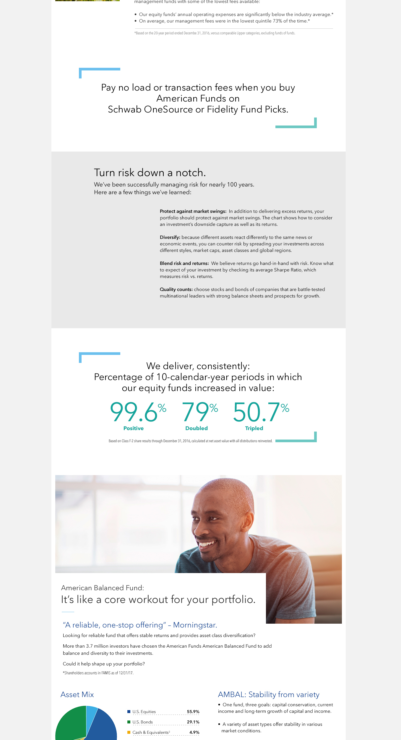
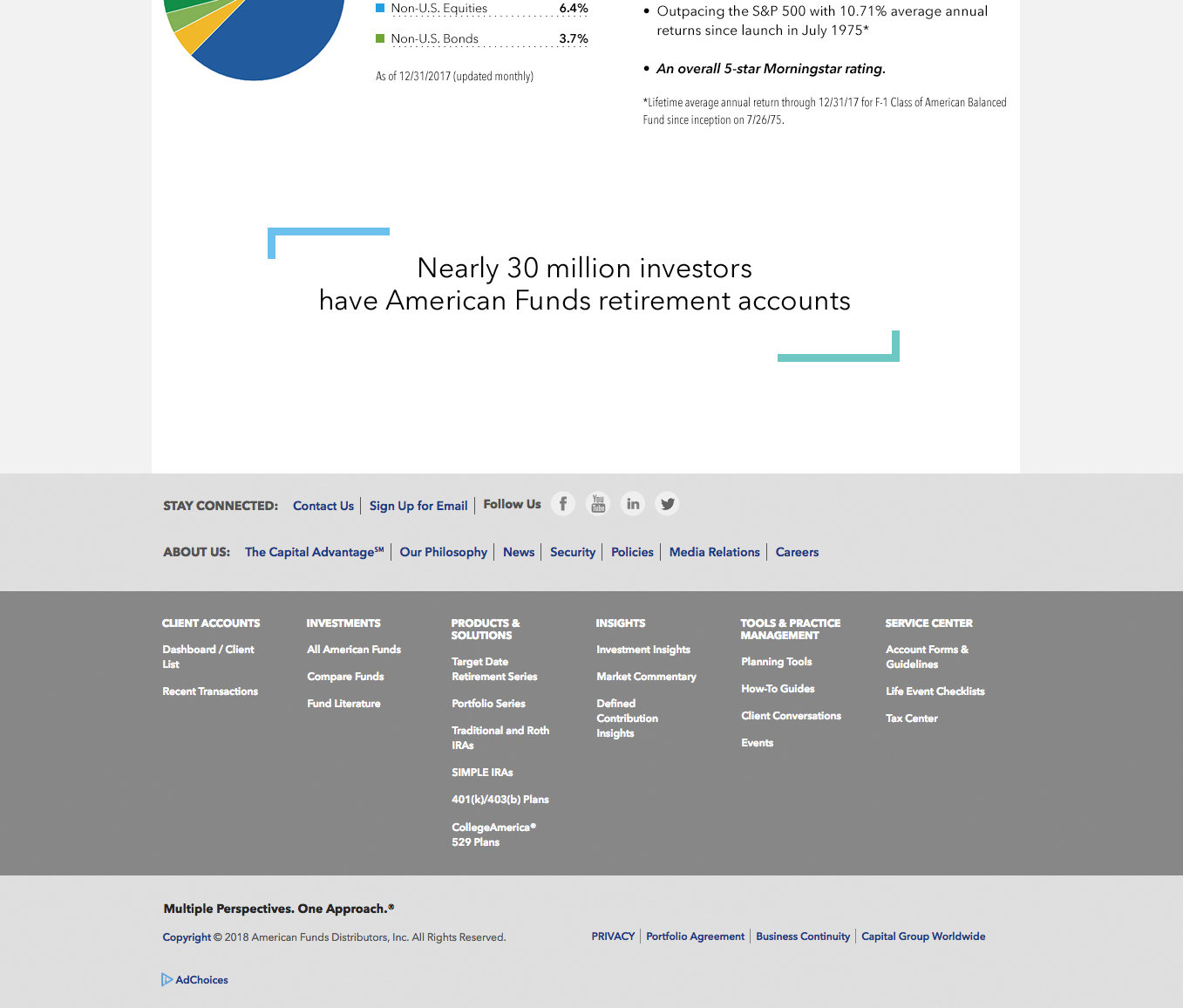
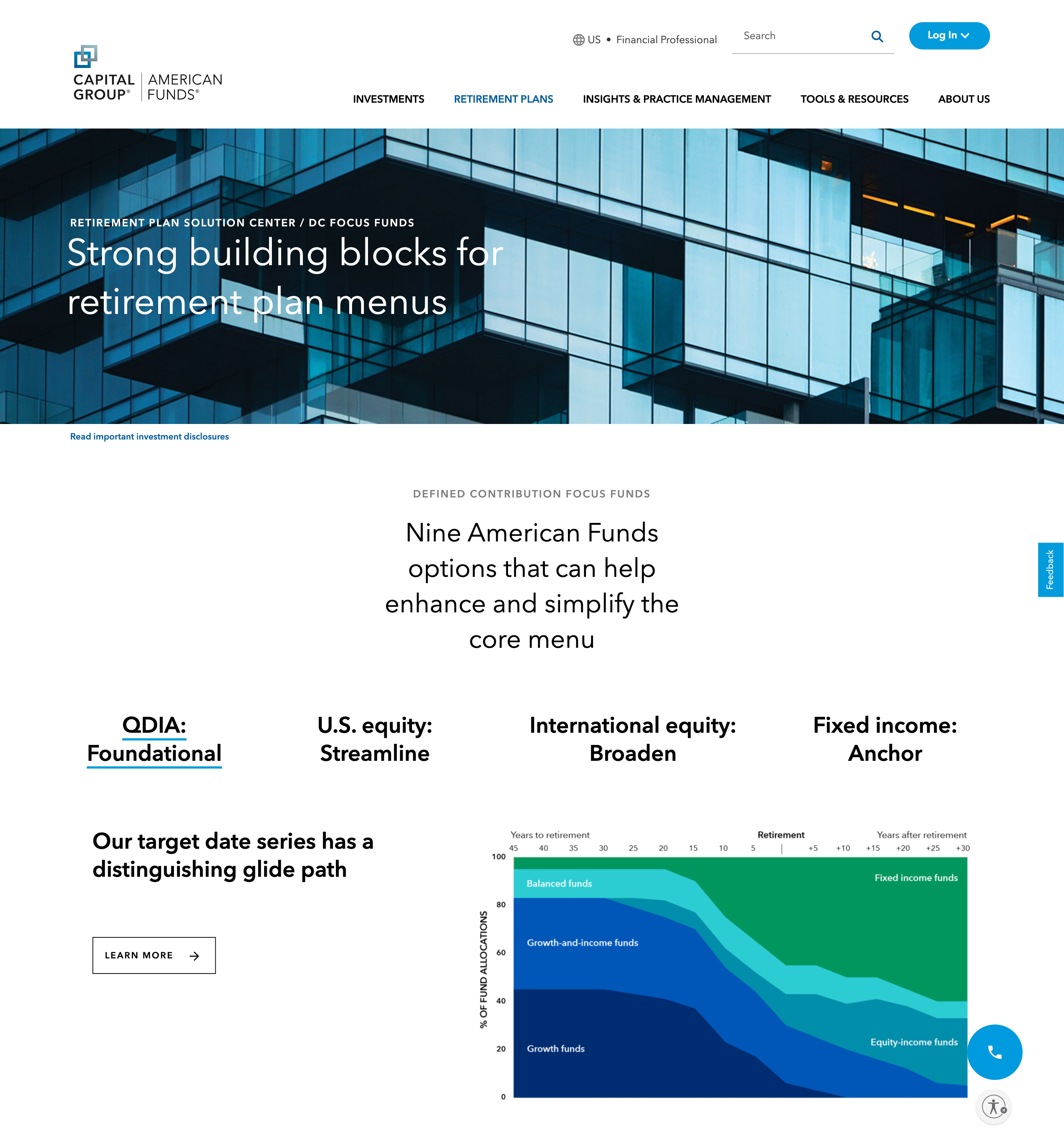
Homepage design of the Capital Group website featuring a clean, modern layout with a prominent navigation menu, high-quality images of diverse investors, and clear, concise text inviting users to explore investment solutions. The design emphasizes user-friendliness and accessibility, with a color scheme that reflects the brand's professionalism and trustworthiness.
PROJECT SUMMARY

Areas of Impact

01 BRANDING

Aimed to weave the essence of Capital Group into every visual element, ensuring that our brand identity is not just seen but felt. This involves a meticulous blend of design principles and the company’s ethos to foster recognition and trust.

02 EXPERIENCE

Enhancing user experience is more than just aesthetics; it’s about creating a seamless, intuitive pathway for our users by simplifying complex information and anticipating user needs.


03 MOBILE

Prioritizing functionality and aesthetics on smaller screens. This focus ensures that our mobile platforms are not only accessible but also engaging, providing a seamless experience that meets our users wherever they are.

04 OUTREACH

Effective outreach is about making meaningful connections. My role involves crafting digital experiences that engage our audience through compelling content and interactive design. Whether it’s through our website, email campaigns, or social media, the goal is to communicate the value of Capital Group in a clear and engaging manner.

05 MESSAGING

In collaboration with our content teams, I’ve worked to ensure that our messaging is amplified by design. This means creating visual elements that complement and enhance our words, ensuring that our message is coherent, impactful, and resonates with our audience.

HOMEPAGE

A Fresh New Look for The Capital Group Website

The newly redesigned and branded Capital Group website presents a cutting-edge, user-centric experience, masterfully integrating contemporary aesthetics with practical functionality. This revitalized platform features intuitive navigation tailored specifically for the financial community, ensuring that every user, from individual investors to seasoned professionals, can easily find the information they need.

Homepage design of the Capital Group website featuring a clean, modern layout with a prominent navigation menu, high-quality images of diverse investors, and clear, concise text inviting users to explore investment solutions. The design emphasizes user-friendliness and accessibility, with a color scheme that reflects the brand's professionalism and trustworthiness.
WEBSITE DETAILS

Screen Designs

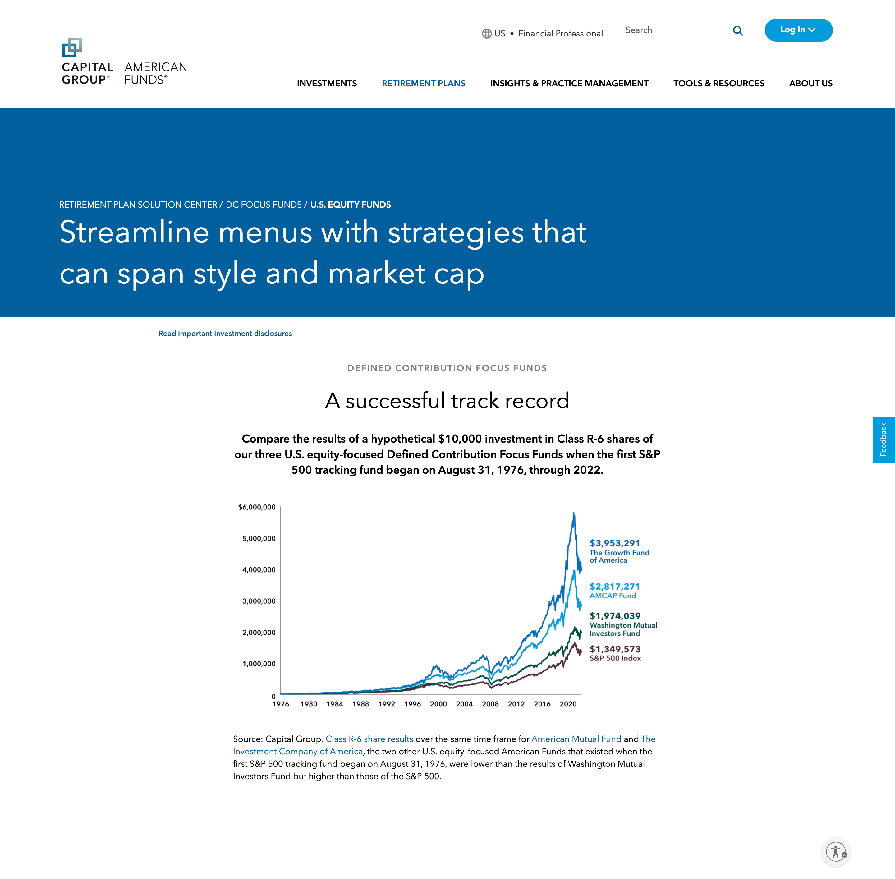
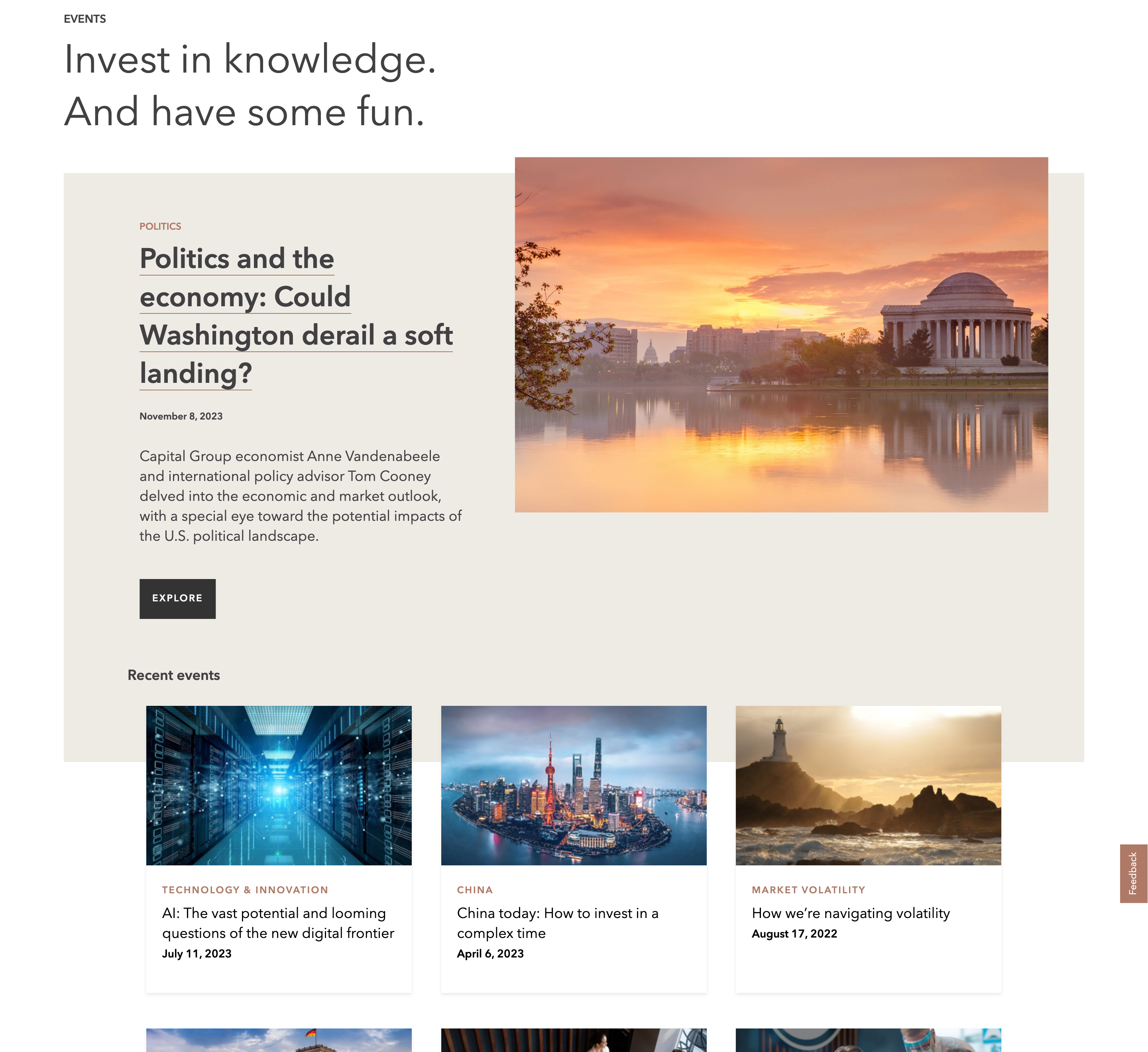
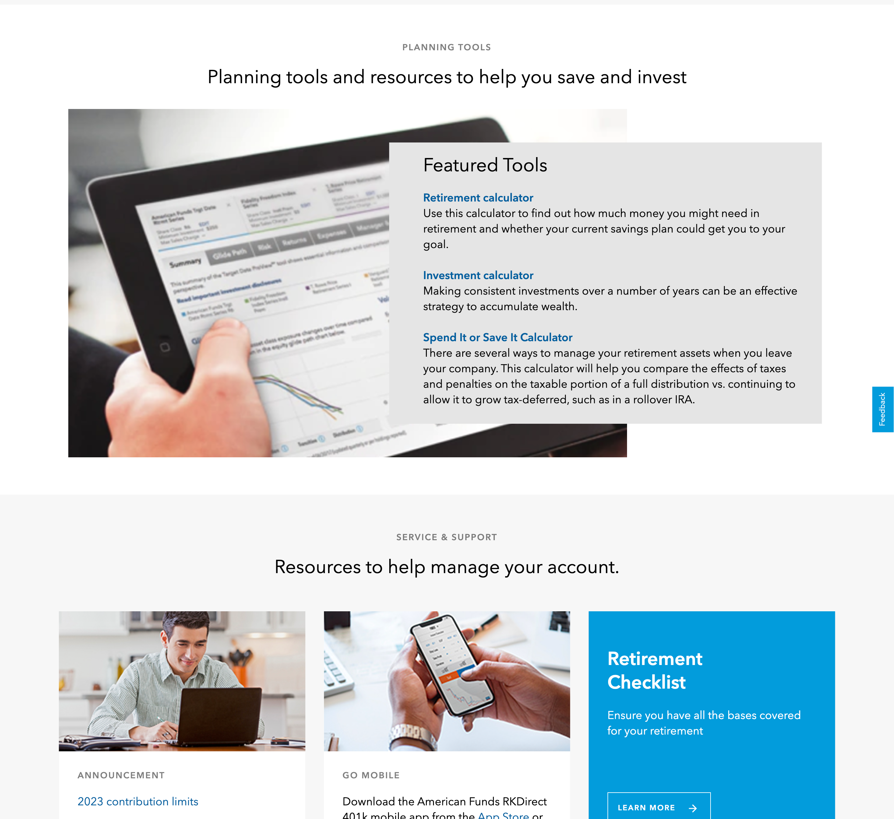
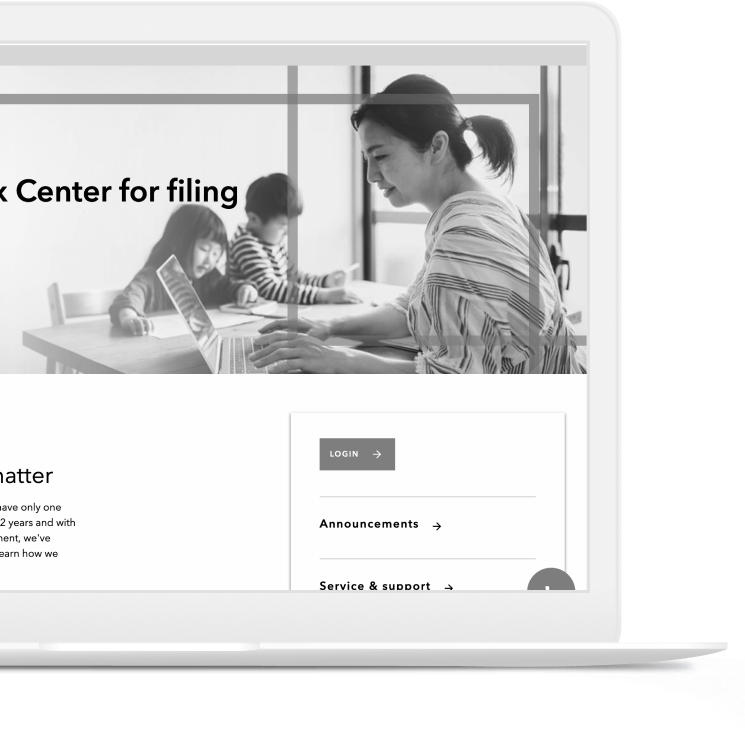
Engaging content is strategically placed to educate and inform visitors, while the fresh branding reflects Capital Group’s commitment to innovation and excellence in the financial sector. The website not only serves as a dynamic hub for industry-leading insights and connections but also sets a new standard for online financial services, enhancing Capital Group’s outreach and engagement capabilities within the global investment community.
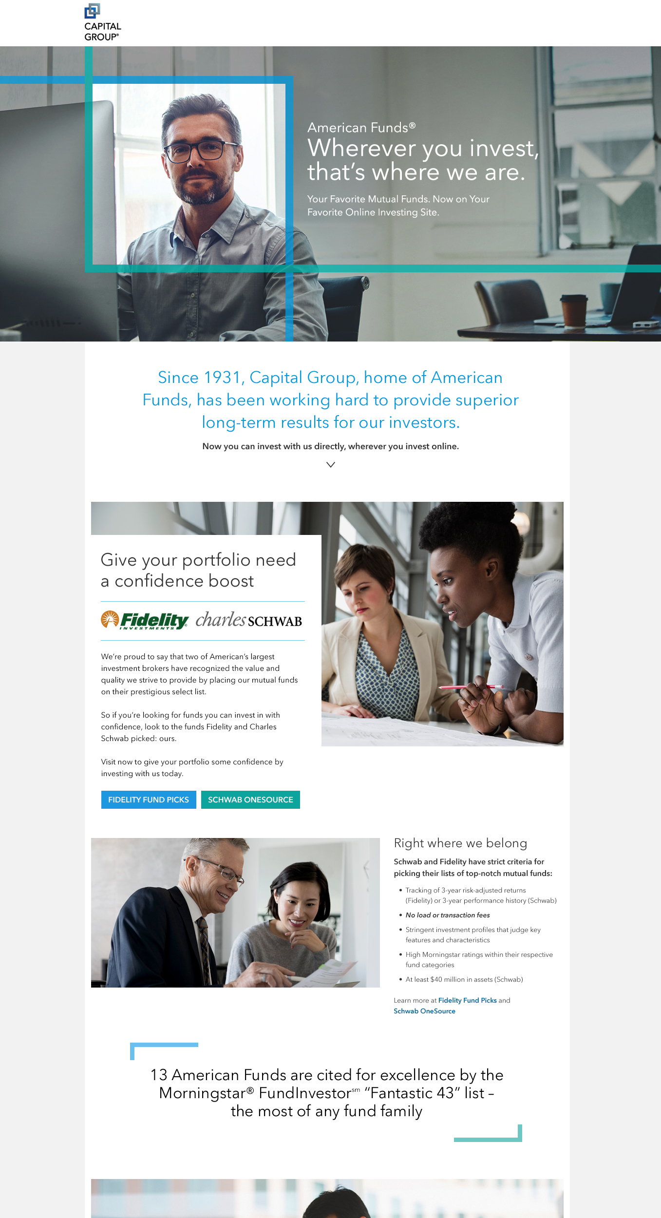
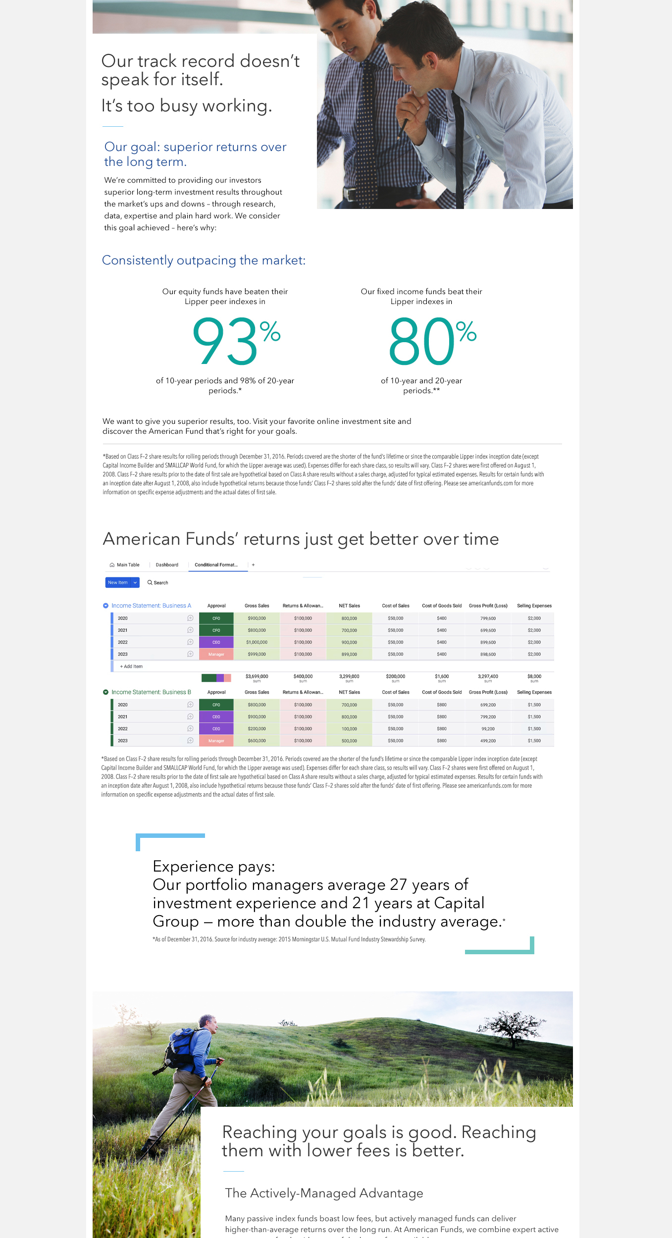
Homepage design of the Capital Group website featuring a clean, modern layout with a prominent navigation menu, high-quality images of diverse investors, and clear, concise text inviting users to explore investment solutions. The design emphasizes user-friendliness and accessibility, with a color scheme that reflects the brand's professionalism and trustworthiness.
RESPONSIVE DESIGNS

Mobile Screens
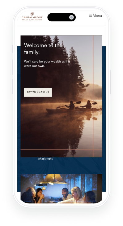
Homepage design of the Capital Group website featuring a clean, modern layout with a prominent navigation menu, high-quality images of diverse investors, and clear, concise text inviting users to explore investment solutions. The design emphasizes user-friendliness and accessibility, with a color scheme that reflects the brand's professionalism and trustworthiness.

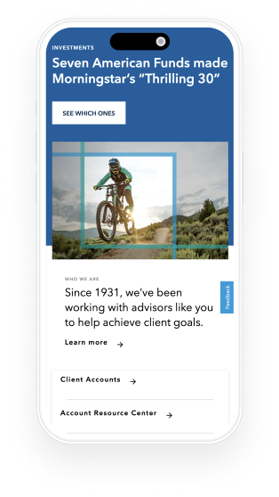
Features were meticulously engineered to function seamlessly across a wide spectrum of screen sizes, ensuring compatibility and optimal performance from mobile and tablet devices to desktop screens.

Homepage design of the Capital Group website featuring a clean, modern layout with a prominent navigation menu, high-quality images of diverse investors, and clear, concise text inviting users to explore investment solutions. The design emphasizes user-friendliness and accessibility, with a color scheme that reflects the brand's professionalism and trustworthiness.

With its mobile-responsive design, the site accommodates users on any device, offering seamless access to Capital Group’s wealth of resources, insights, and investment solutions. This enhanced mobile responsiveness effectively created new engagement funnels, amplifying the brand’s reach and impact.
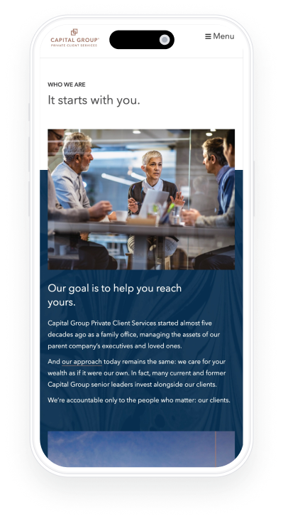
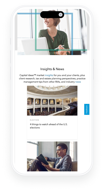
Homepage design of the Capital Group website featuring a clean, modern layout with a prominent navigation menu, high-quality images of diverse investors, and clear, concise text inviting users to explore investment solutions. The design emphasizes user-friendliness and accessibility, with a color scheme that reflects the brand's professionalism and trustworthiness.
TYPE CHOICES

Typography

Avenir was selected for its crisp and inviting appearance in larger displays, while Inter was chosen as a complementary typeface due to its excellent legibility in smaller text sizes, enhancing the overall readability and user experience on the website.

TYPOGRAPHIC SCALE